Argos Ireland Website Redesign
After becoming frustrated with the experience of using the Argos website, I took the opportunity to conceptualise a redesign of the popular retailer’s online presence.
I would modernise the visuals and improve the overall experience of discovery and purchasing from the store.
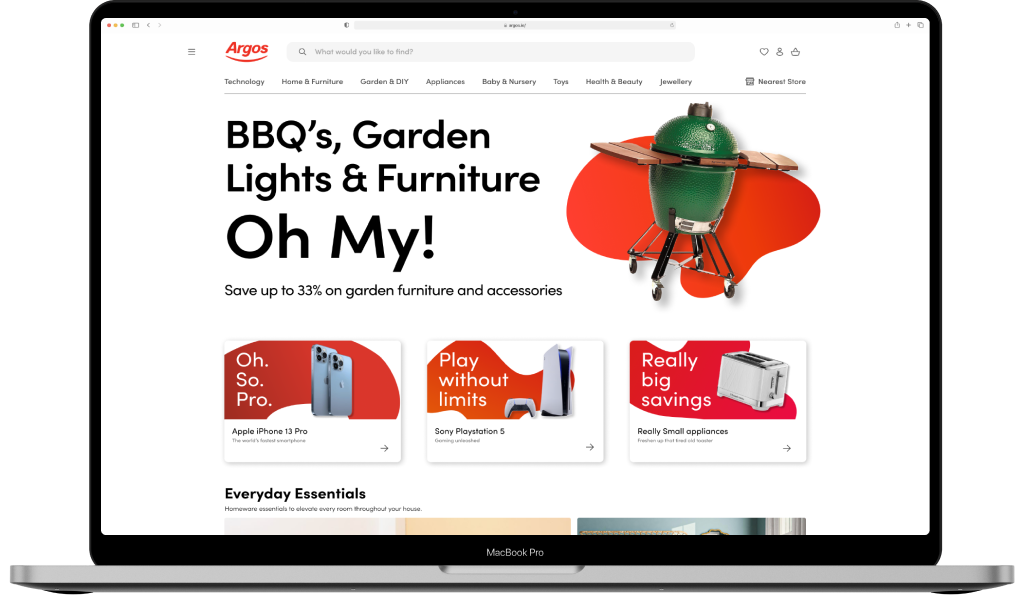
The original Argos design

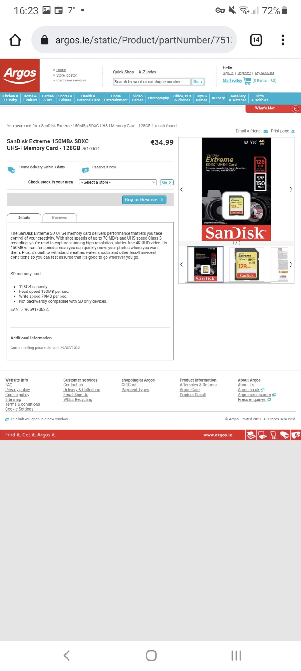
The search bar does not offer any auto complete feature or suggestions to the user.
Search results do not combine multiple SKUs, leaving the user with 64 different search results when looking for a new iPhone 13. Items that are out of stock are displayed above those that are in stock.

The homepage is not responsive and renders at a fixed width, leaving it very narrow on modern 2K and 4K display resolutions.
There are multiple sections in the header fighting for the users attention, and there is very little design hierarchy throughout the entire page.

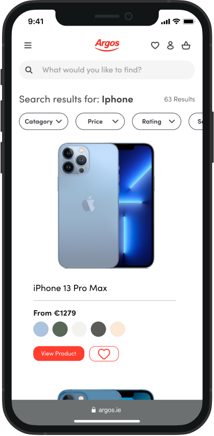
The mobile view shares no visual identity with the desktop version and is more modern in many ways. Despite this, clicking ‘Buy Now’ on any product within the mobile view will kick you out to the desktop view to complete the purchase. It is not possible to buy anything without having to navigate a small and confusing interface while on mobile.